
Digital Product Design
ecosyste.ms
A platform-wide brand and design system for an open-source sustainability initiative, unifying more than a dozen data-heavy services under a single visual and interaction framework.
Role: Design Lead Client: Open Source Collective Date: 2024-2025 Visit: https://ecosyste.ms
The problem
Open source software powers everything we use, but the most critical projects often struggle to get the support they need. ecosyste.ms had cracked part of this puzzle with their data-driven approach: they built a dataset tracking 230 million repositories, identifying which projects were truly critical. But having great data isn’t enough if you can’t communicate it effectively. They needed a brand and compelling look and feel to support their mission, and a design system to build out their products with confidence and efficiency.
What I did
As the Design Lead on the project from initial brand concepts through to implementing the design across their product suite.
I started by creating a visual identity that could work across multiple products, speak to diverse audiences, and grow and adapt to the needs of the platform.
With the foundations in place, the technical work began. ecosyste.ms builds everything on Bootstrap, so my next job was adapting and theming that framework to bring the brand to life across all their tools and services.

Branding and visual style

Iterating on the brand from the first concept to the final logo design
Developing a brand for ecosyste.ms started by diving deep into the problem domain. This involved a lot of sketching—mapping out user personas, stakeholder relationships, and the complex web of dependencies that make up software ecosystems.
We decided the visual identity needed to reflect this interconnectedness, but also precariousness, while remaining clean and approachable, but most importantly: versatile.
After iterating on some early concepts we settled on the balanced stone motif, a call back to the famous xkcd comic.
With the brand established I began to work up variations for different uses and colours, as well as a brand system to help manage the extensive applications it would be used across.
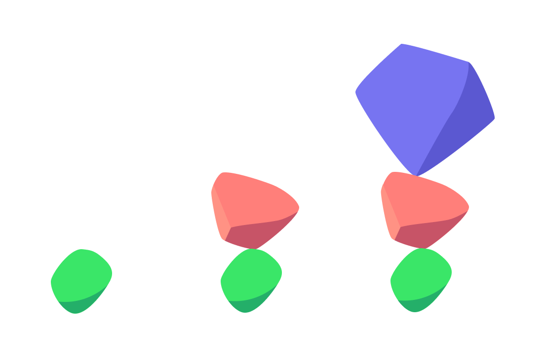
As well as this I developed icons and illustrations to use across in press releases, marketing materials and digitally.


The brand work included:
Concepting and iterating on a branding approach, including competitor and sector analysis, and testing with senior stakeholders
Creating a flexible, extensible logo system that worked across different contexts and uses
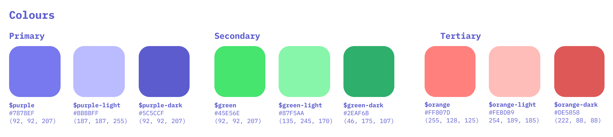
Establishing a harmonious colour palette with considerations for us in data visualisation
Designing iconography that could represent different aspects of software ecosystems
Developing illustrations for editorial and infographic purposes
If you’re interested to hear more about this part of the project, I’ve written a blog post for just that.


Design system
Developing a visual style to work with the brand was straightforward but nuanced. We used Bootstrap as the front-end framework so the basics were in place, but had to carefully extend the user interface styles to ensure the front-end was accessible and flexible, as it would be rolled out across dozens of web applications.
The design system covered:
UI components that could scale across multiple tools
Layout grids and spacing systems for consistency
Data visualisation standards for charts and graphs
Template systems for different types of content
Comprehensive documentation for future team members


Implementation
Turning the design system into a working, scalable product suite
Once the design system was in a stable place, the focus shifted to implementation. All of ecosyste.ms’ products—from dashboards to account management screens—depend on Bootstrap as a foundation, so the first step was mapping the design language cleanly onto the existing component architecture.
This meant working closely with the engineering team to introduce a token-driven approach to colour, typography, spacing and motion, ensuring the brand was applied consistently, but without fighting the framework.
Much of the work involved translating abstract design rules into reliable, reusable code. This included refactoring existing components, defining new ones, and introducing guardrails so the visual language stayed coherent even as new features were shipped.
Aligning products under the new design system
As the project expanded, I helped implement the design system across the platform:
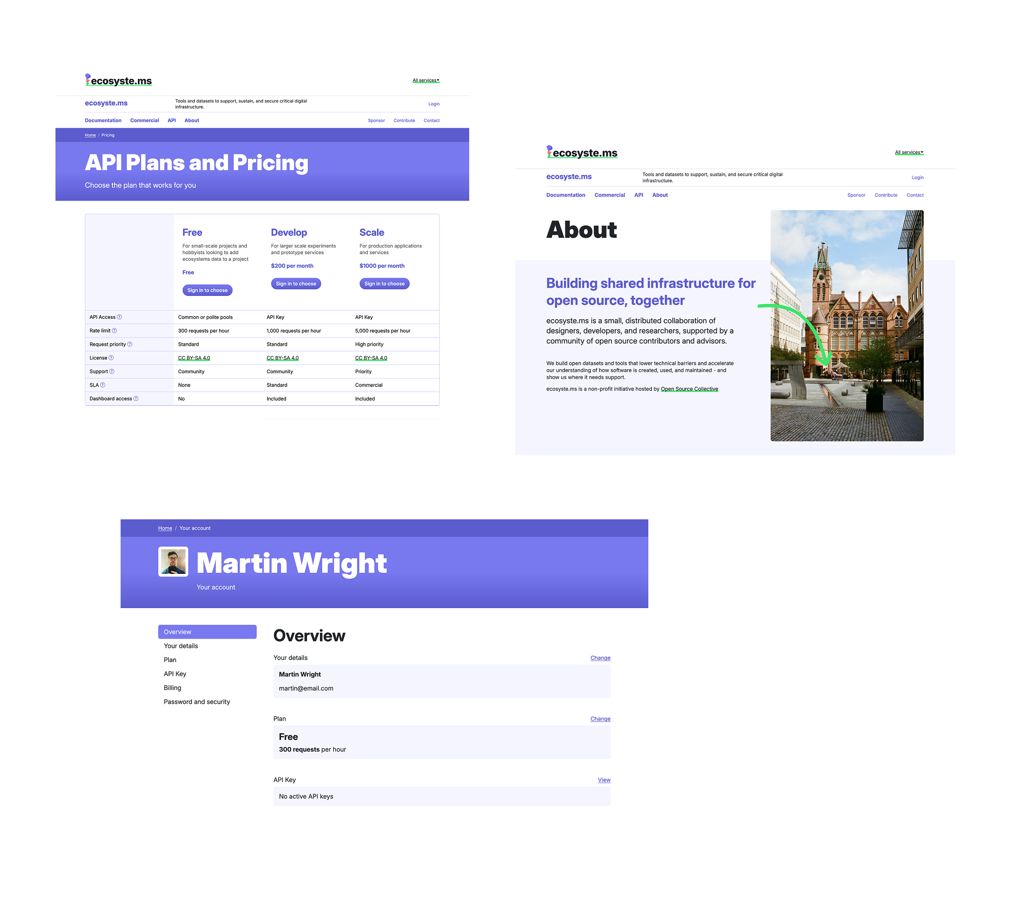
Accounts, billing and pricing workflows: supporting the move towards a clearer SaaS model. This included the pricing table, subscription flows, payment method handling and plan management screens.
A revised ‘About’ and new organisation site pages: bringing the storytelling, brand expression and credibility signals up to the standard of the core product.
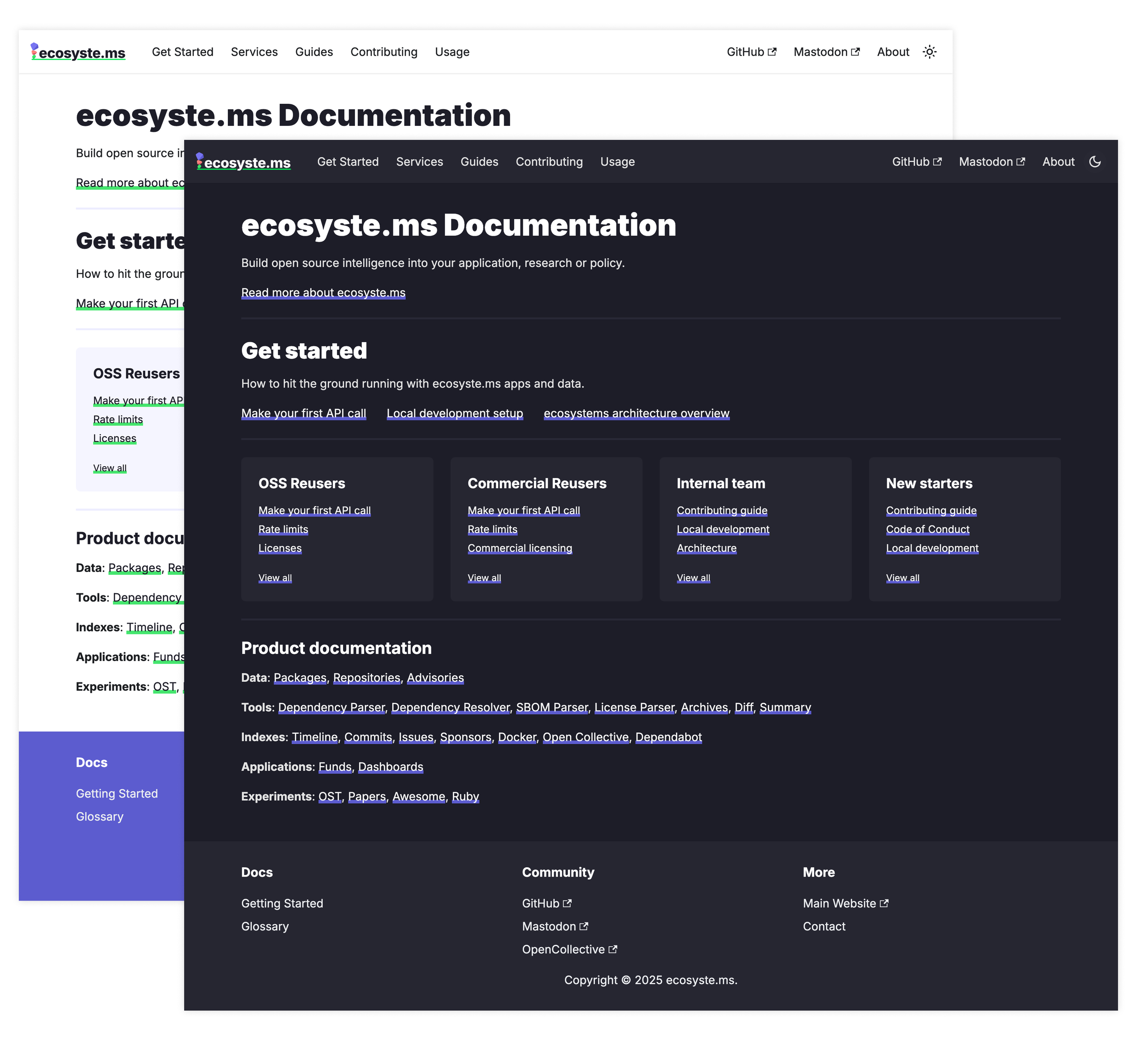
A rebuilt documentation site: improving navigation, readability, and structure so complex developer guidance became easier to understand and maintain.
Dashboard and data-heavy screens: applying data visualisation standards to charts, tables and API-driven views.
Many of these areas hadn’t previously been designed cohesively. Implementing the system allowed us to modernise interactions, improve accessibility, and introduce sensible defaults so future work is more consistent and faster to ship.
Collaboration and workflow
A significant part of implementation was working hand-in-hand with the developers. I produced:
Pattern libraries and coded examples to reduce ambiguity
GitHub-friendly documentation for component usage
A backlog of UX improvements tied to technical feasibility
Iterative QA with the engineering team to ensure parity between design and production
This collaborative rhythm helped the team move quickly without sacrificing quality.
Performance, accessibility and resilience
Because ecosyste.ms serves a broad range of organisations, including governments, universities and open-source foundations, robustness mattered as much as aesthetics. Implementation work included:
Ensuring WCAG-compliant contrast and keyboard behaviour
Reducing unnecessary UI weight across templates
Stress-testing layouts with unpredictable data states
Designing for error handling, loading states, and empty states
This created an interface that not only looked consistent but behaved predictably in real-world conditions.
A foundation for growth
The ultimate measure of the implementation phase is that the team can now ship faster with fewer design decisions to revisit. The system gives them a shared language: colours, components, interactions and documentation that scale across dozens of tools. New features—internship dashboards, governance interfaces, fund reports, and beyond—slot naturally into the framework without re-inventing anything.
This phase connected the dots between brand, design and code. It ensured the work delivered was a living system supporting a platform with real technical ambition.
Key moments
Making the complex simple
We had no lack of data, but the biggest challenge was figuring out what information was important. We developed visual metaphors and clear information hierarchies that supported turn months of technical analysis into a five-minute conversation.
Supporting real impact
When Ecosystem Funds launched and started distributing actual money to maintainers, seeing the design system support that process was incredibly rewarding. The transparent reporting features we’d built helped funders see exactly where their money was going and what impact it was having.
Building for the future
One of the things I’m most proud of is how the design system has continued to support new features and partnerships. The modular approach means the team can launch new tools without starting from scratch each time.
The results
The platform has already made a real difference in the open source community. Ecosystem Funds supports 291 different software ecosystems and has distributed over $75,000 to projects that need it. More importantly, it’s changing how organisations think about supporting the software they depend on.
But the real measure of success is that maintainers are getting paid for their work, and critical infrastructure is becoming more sustainable.This project reminded me why I love working on things that matter. Good design doesn’t just make things prettier, it can amplify important work and help create positive change in the world.

