Charity Website Design
Botanical Society of Britain and Ireland
Using user-centred design to build world-class digital foundations for a world-class institution.
The problem
The Botanical Society of Britain & Ireland (BSBI) is one of the oldest and most respected botanical organisations in the world. Their data, volunteers and publications underpin conservation policy, academic research, and local natural history work across Britain and Ireland.
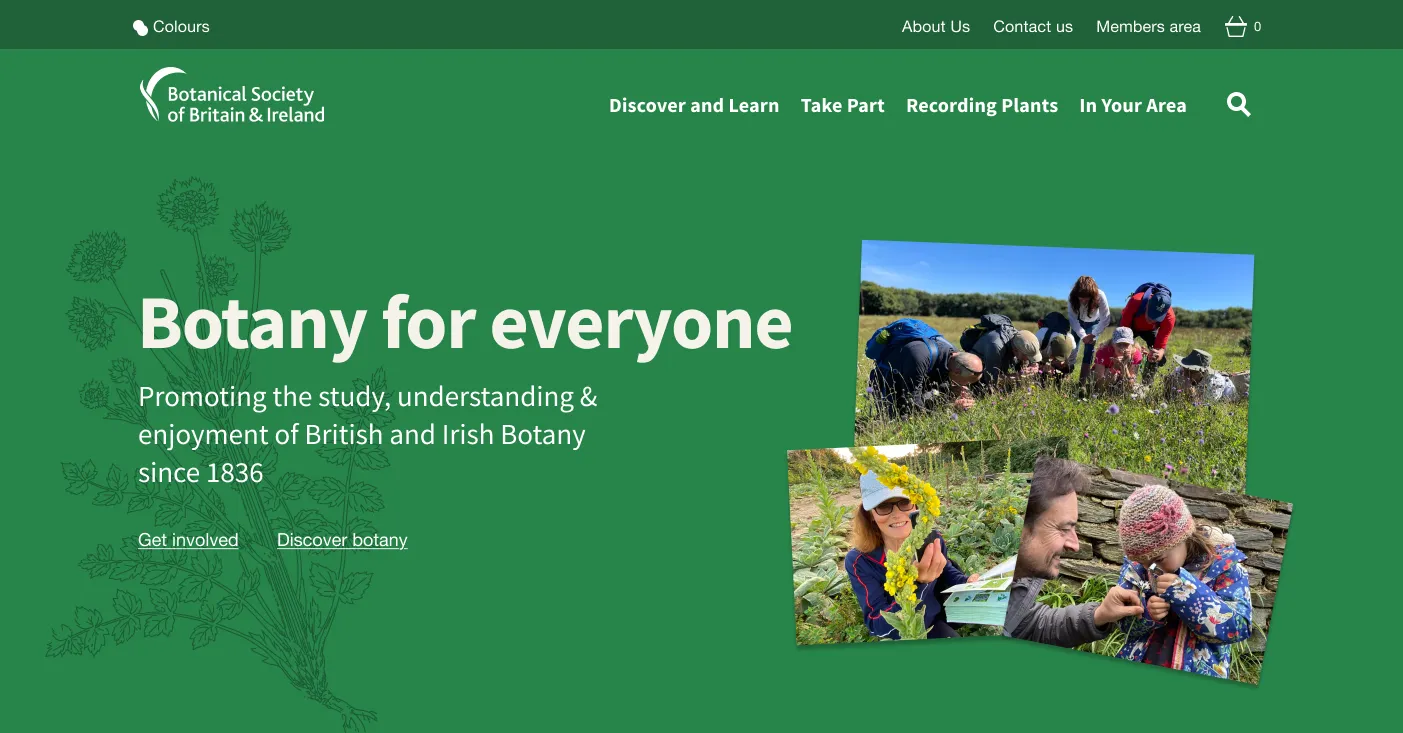
Their existing website no longer reflected the organisation’s strengths or supported the growing diversity of their audience. Experienced botanists knew exactly where to go, but newcomers felt overwhelmed. Pages were dense with text, the navigation was inconsistent, and much of the site’s best content was hidden.
BSBI wanted a website that felt welcoming and accessible, while still doing justice to the depth and rigour that makes their work so vital to the wider botany community. They needed a design system and front-end framework that could support future products and integrate smoothly with Kirby, their new CMS platform.
What I did
I led the complete design process, combining research, design direction, content structure, component design, and front-end prototyping. I also partnered closely with the in-house team, supporting implementation, answering design questions, and helping embed the system into their new CMS and workflows.
User research and insight
Working with a researcher, we spoke to eight users from across BSBI’s wide audience spectrum: a mix of absolute beginners, seasoned recorders, trainers and long-standing members, alongside senior stakeholders. We supported this with a brand positioning workshop, I also reviewed surveys, analytics, and existing content.
Insights
Speaking to users and stakeholders revealed a set of clear opportunities for the new website – areas where design could support BSBI’s mission, strengthen engagement, and make the organisation’s work easier to access and understand.
Create a welcoming, structured first impression
Users wanted an entry point that felt calm, focused, and reflective of the organisation’s character. An organisation like BSBI can be intimidating to novices, so we saw an opportunity to make the first visit as warm and welcoming as the organisation itself.
Bring coherence and simplicity to navigation
People expressed a desire for structure and predictability. This was an opportunity to build intuitive pathways for both beginners and experts and consistent navigation patterns that reduce cognitive load.
Showcase BSBI’s depth and authority
Users repeatedly praised the richness of BSBI’s resources. Rather than “fixing” anything, this gave us a chance to elevate and reveal that value by highlighting key resources in more visible ways and improving findability through layout and signposting.
Support a wide range of users with accessibility-first design
Members span all ages, levels of experience, and device types. This was a strong prompt to prioritise accessible typography and spacing, robust contrast, thoughtful component behaviour across devices, and more inclusive interaction patterns.
Simplify pathways to the things users care about most
Interest in tools such as plant ID guides, maps, events, and training pointed to an opportunity to bring core resources closer to the surface and reduce the number of steps to reach them.
Show, and strengthen, the supportive BSBI community
Users spoke about BSBI with warmth – learning together, supporting others, contributing data, and feeling part of something meaningful. This was an opportunity to reflect that community spirit in tone, imagery and layout, balance institutional authority with human warmth, and invite people in rather than assume expertise.
Stakeholder insights
Stakeholders echoed similar points: the desire for a welcoming, “botany for all” feel; better visibility of local groups; a clearer pathway for beginners; and preserving BSBI’s scientific authority while widening appeal.
These insights became the foundation for the design direction.
Design direction
The goal was to balance warmth and approachability with clarity, structure and rigour. The look and feel needed to feel unmistakably BSBI while supporting:
- Accessibility
- Trust and authority
- Ease of scanning
- Lightness and performance
- Longevity
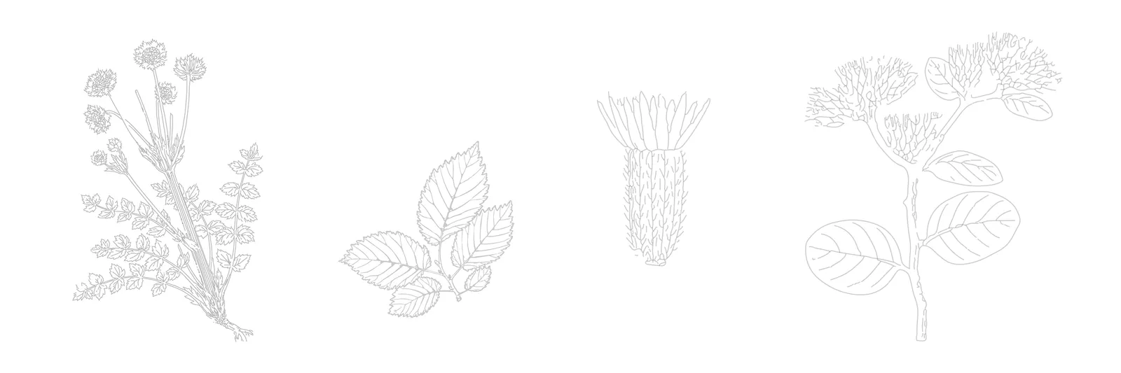
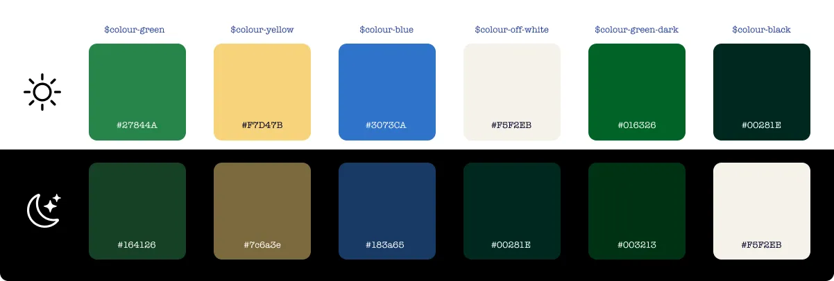
I introduced a refreshed palette, improved spacing, and a calmer typographic rhythm. We digitised archival botanical illustrations and used them sparingly as design elements – giving the site a sense of identity without overwhelming the content.

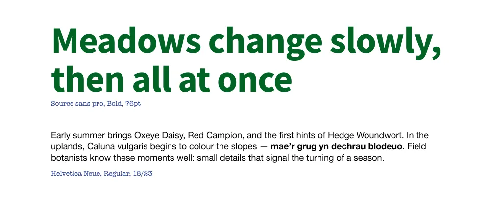
Choosing the right font
To meet the goals for the project font selection became a design decision grounded in constraints, not aesthetics alone. I had to consider:
- Brand alignment
- Welsh and Irish language support
- Download sizes and environmental impact
- Rendering performance on older devices
- Integration with complex UI components
- Licensing costs and future scalability
The result was a font pairing that balanced performance, clarity, compatibility, environmental footprint, and tone of voice – a decision that carried the character of the whole site.
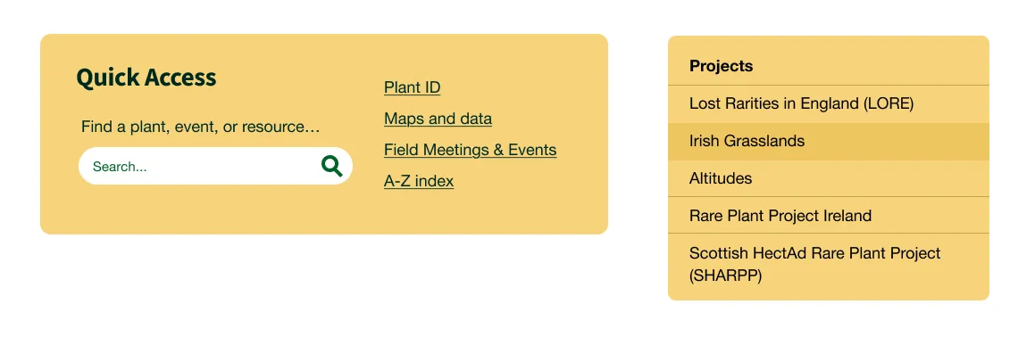
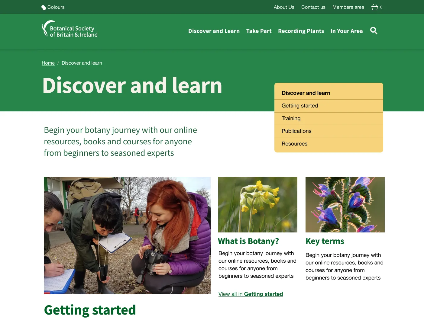
Wayfinding through consistency
A key insight from our research was the importance of maintaining well-used pathways for expert and return visitors. We adopted a high-contrast yellow colour to highlight these pathways and build a cognitive association. BSBI’s users should associate yellow with speed, task completion and shortcuts to their tools.
Bringing clarity to complexity
The biggest challenge the design had to address was presenting a vast amount of botanical content in a way that supported beginners without frustrating experts. Using research-led visual hierarchies and conventional component patterns, we reduced overwhelm and brought BSBI’s hidden value to the surface.
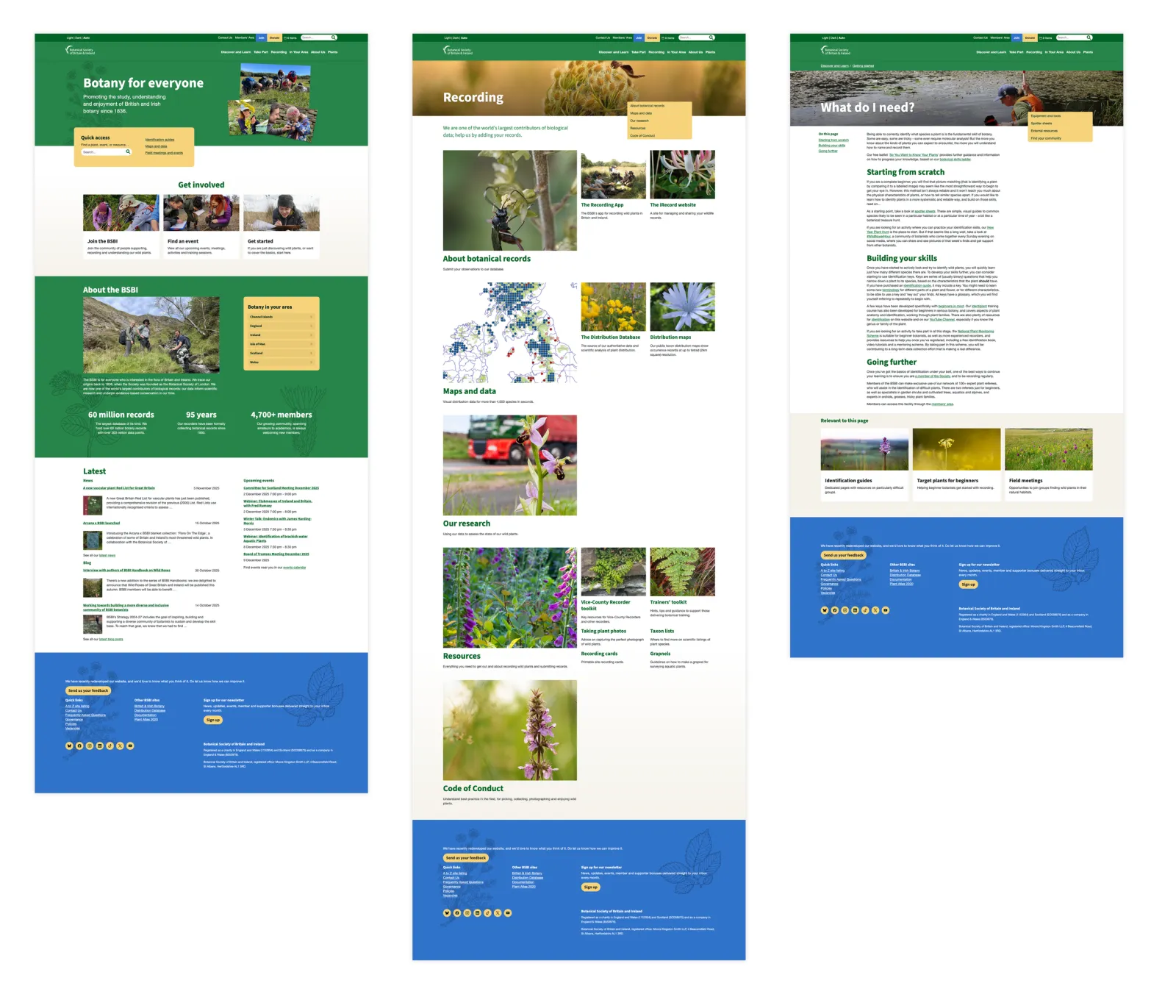
Design system
BSBI needed a component library that would work across multiple sites and applications, supporting Kirby’s editing model, while remaining accessible and performant.
Core components
Using atomic design principles, supported by Bootstrap, I created and customised a component and layout system covering:
- Buttons, forms, cards, navigation
- Accordions, tables, notes, downloads
- Content blocks for editors
- Image galleries and responsive media
- Page structures for category and content templates
- Event listings, blog posts, species accounts, policies, products, projects
- Local group and vice-county layouts
- Search results and filters
All designed to work in both light and dark mode, with CSS custom properties enabling theme switching efficiently.
Importantly, everything was built to degrade gracefully on older devices and slower networks – essential for users doing fieldwork.
Accessibility
Accessibility was a first-order design constraint. I designed to meet WCAG guidelines not just in theory but in real use:
- Compliant colour contrast across both light and dark mode
- Robust keyboard navigation and focus states
- Clear reading order on small screens
- Legible type pairing
- Simplified layout structures
- Human interface guidelines (HIG) compliant target sizes for touch
- Support for assistive technologies
Prototyping in code
To ensure a realistic integration with Kirby, I produced browser-ready prototypes covering:
- Homepage
- Category pages
- Content templates
- Navigation and header/footer system
- Dark mode versions
This allowed the development team to drop the designs directly into the CMS, test in context, and iterate quickly.
I also supported development integration throughout, helping solve structural issues, naming conventions, and component edge cases.
Key moments
Bringing warmth and rigour
User interviews made it clear that the current site didn’t reflect the supportive, welcoming atmosphere of the BSBI community. The new design system brings together people, plants, photography and illustration to convey a more accurate picture of who BSBI is.
Designing for everyone
Older users and beginners struggled most with the old site. This led to choices around contrast, type scale, affordances, and dark mode that made the new system easier to use for all audiences.
The planet as a stakeholder
Incorporating sustainability targets meant continually stripping out unnecessary weight – choosing typefaces responsibly, using assets strategically, and optimising the CSS and image pipeline.
The results
By the end of the project I’d delivered:
- A clear design direction rooted in user needs, uncovered in a user-centred design process
- A complete, scalable design system ready for use across multiple products
- An accessible front-end framework tailored to integration with Kirby
- Front-end prototypes meeting accessibility and environmental performance targets
- A foundation for BSBI’s digital products, supporting beginners, experts, and everyone in between
Instead of assuming expertise, the new design puts user journeys, accessibility, and clarity at the heart of the organisation’s digital presence.
The project continues into the next phase, but has already delivered the grounding BSBI needed: a system that shows the organisation at its best – authoritative, welcoming, and built for everyone who cares about plants.
Beginning with user needs gave us the clarity and confidence to shape something that can last. The system we’ve built is more than a set of templates: it’s the basis for a future digital presence that reflects BSBI’s community, ambition and expertise. For a world-class organisation, this work provides a world-class foundation – one that will support future growth as new tools, platforms and possibilities emerge.
Martin took the time to understand us as an organisation, and that care showed in the design he produced for us.
He worked closely with us as a part of our team during the project, giving friendly and wise counsel and sharing his considerable experience of the whole website change process.
He left us not just with a great design, but a design system that we can work with in the future. We would strongly recommend working with Martin.
— BSBI Project Lead