I’ve been building a web app called Tone Ladder to solve a problem I believe exists in digital design: we’re really bad at colour, and our tools don’t help.
Tone Ladder is a small web app I’ve had knocking around in my head since my first art class about ten years ago.
When you learn about colour in painting, you’re taught to think about how it behaves under light - specifically how the colour of the light itself affects the hue of what you’re looking at: Under a warm light, colours shift toward yellow as they get lighter, and away from yellow in shadow. Under a cool light, the opposite happens.
If that sounds a bit abstract, it’s much easier to see than explain:
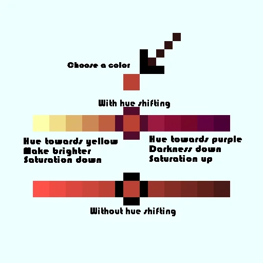
Artists who really understand hue shifting are able to bring scenes to life with vivid, expressive colour. Work that ignores it can look chalky, flat, or oddly lifeless, even when the colours are technically “correct”.
If you’ve worked in web or product design, you’ve probably already made the same connection I did. Most of the time, when we generate colour variants, we just lighten or darken a single value and call it done. The maths are neat. The results are predictable. And very often, they’re boring.
Tone Ladder is an attempt to bring some of that painterly thinking into digital colour work.
“I wanna be smacked on the face by a rainbow when I look at my art.”
— Brandon James Greer
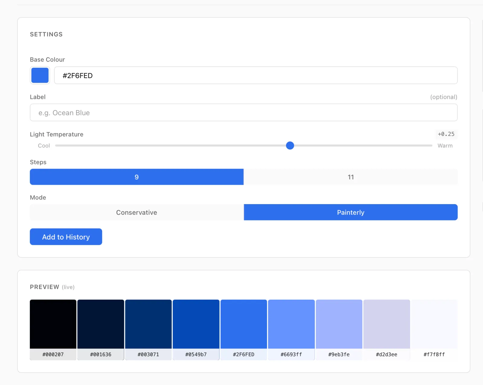
You start with a single colour. You choose a light temperature (cool to warm), decide how strong you want that light to be, and pick one of two modes:
-
Conservative, which stays close to the original hue and gives you usable, sensible variants out of the box
-
Painterly, which pushes further into more expressive “face smacking” territory and lets the colour really move
Instead of just scaling lightness, each step in the ramp shifts hue in response to the simulated light, the same rule painters use instinctively.
Tone Ladder is also an experiment in building a product with AI.
I’ve been curious about Claude Code for a while, partly to learn the tooling, partly to understand where all this is heading, and partly out of mild professional dread. This idea felt like a good excuse to try something real. I’ll write more about that side of things soon.
It’s not perfect. Light and colour are a genuinely hard problem space22 I’ve spent more time thinking about ΔE-based spacing and perceptual guardrails than I was prepared for. I thought this was just going to be a simple ‘darken and mix in a bit of yellow’ algorithm. I was very wrong.: human perception, limited colour gamuts, modern screens, maths, and taste all collide here. You’ll almost certainly find combinations that surprise, delight, or disgust you - by design.
By design because, rather than locking the tool down with lots of colour-specific rules, I’ve found it’s better to let those edges exist and move on. Sometimes the most useful thing a colour tool can do is show you how the theory plays out in all its glory — even if you ultimately dial it back.
Please go and have a look at Tone Ladder, and if you’re really interested, here’s the source code. If you have thoughts, send them my way. And if you use it in a real project, I’d especially love to hear how it went.